The journey of one credit card, told through three very different cardholders.
A prospect, a points optimizer, and a loyalist, each meeting the card at a different point in their journey.
JetBlue owned acquisition, Barclays owned the cardholder side, and IBM iX designed across both. Here's where I led and where I contributed.
IBM iX, JetBlue, and Barclays ran discovery together before design began. The three teams built personas from cardmember interviews and existing Barclays survey data. We used them as a reference throughout the project.

Planning her honeymoon. A comparison-driven shopper with a TrueBlue number she never uses.

Three years in, he "plays the game," paying mid-cycle to maximize points. Wants everything at a glance.

A JetBlue superfan who plans trips around redemptions. Wants the card to make them memorable, not just bookable.
Discovery ran across all three teams before design started. These are the numbers behind what we worked from.
Both surfaces operated inside existing design systems with real constraints. Every decision had to work within them: JetBlue's marketing system on one side, Barclays' regulated financial system on the other.
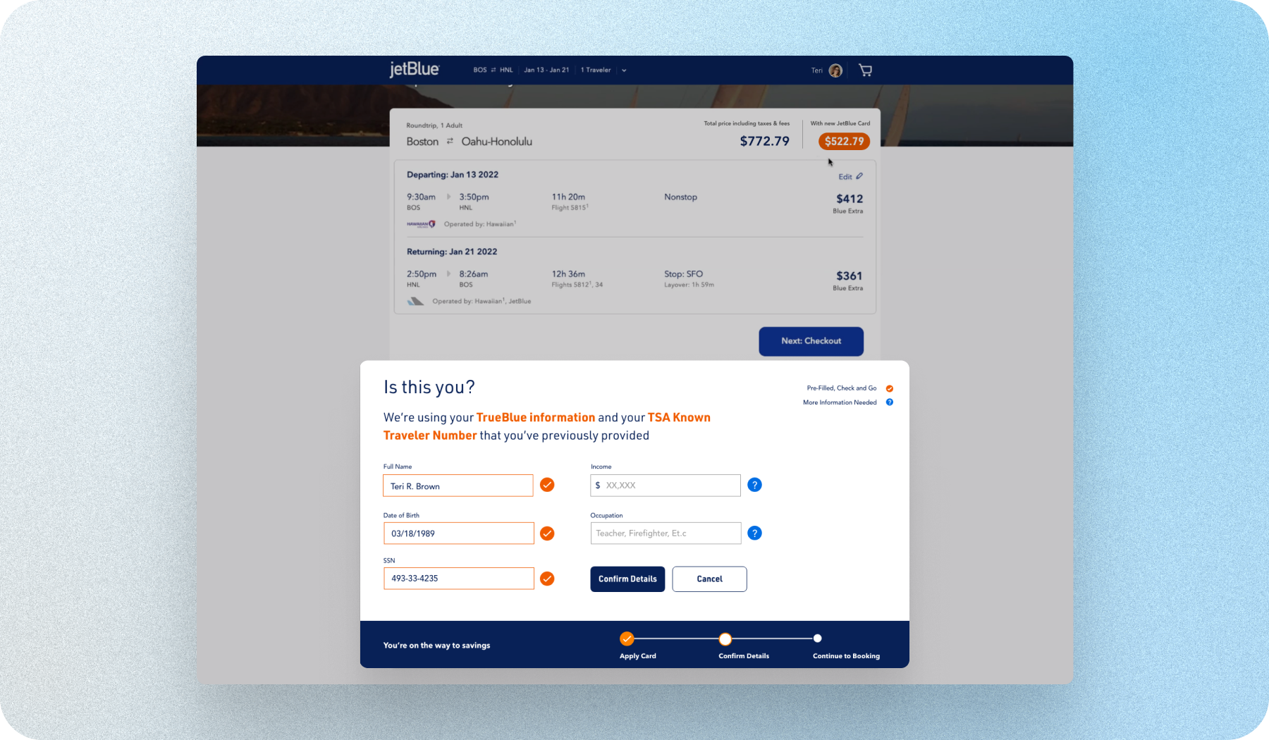
Research showed the card appearing at checkout, after fare selection, was too late. Nobody was stopping mid-payment to apply. Moving it earlier, into the trip-planning phase, put the card's value in front of people while they were still deciding.

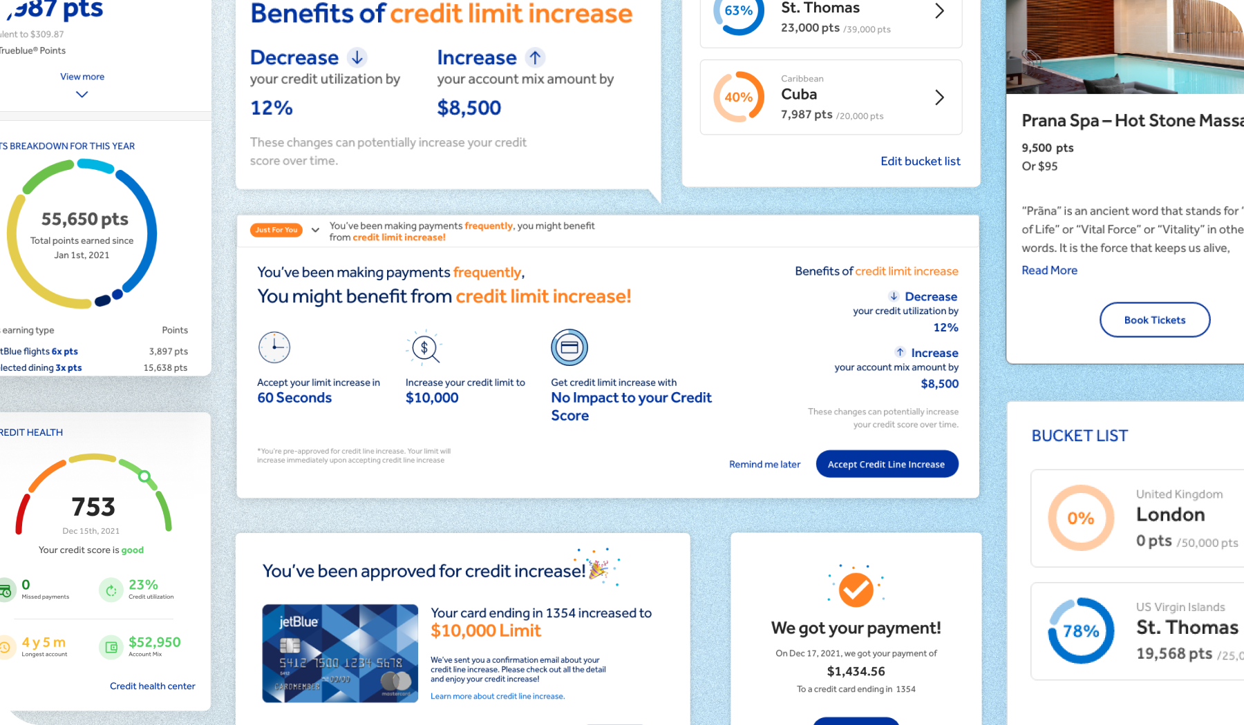
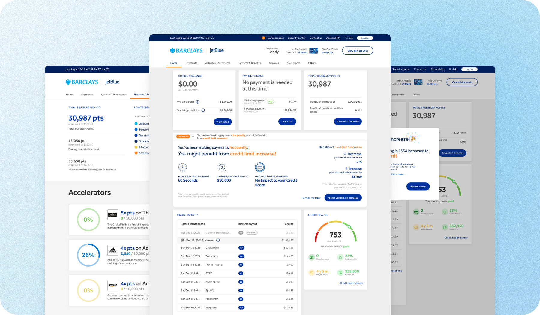
The existing Barclays experience treated everyone the same, whether you'd had the card three months or three years. Same layout, same benefits page, same payment flow. The redesign was a modular dashboard that changed based on how someone actually used the card. All built inside Barclays' regulated financial design system, which is dense and compliance-heavy by necessity.
The widget structure mattered beyond just the launch. New benefits could be added later without redesigning the whole surface. That's what made it worth building as a system rather than a page.

The same cardmember behaves completely differently on a booking page versus a dashboard page. A lot of the design was just deciding which surface owned which moment.
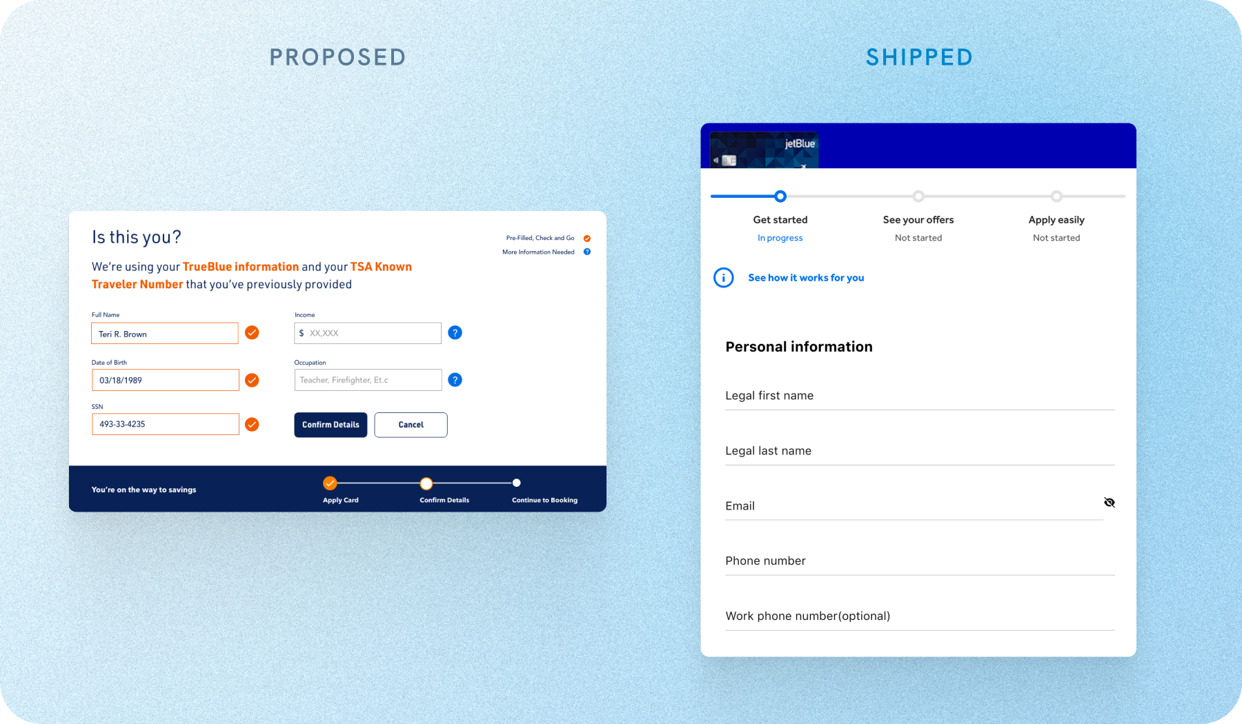
Teri's journey. The design established the strategic direction and interaction patterns for surfacing the card during the booking flow. JetBlue applied the concepts to a dedicated card acquisition page, implementing the themes and patterns rather than the designs directly.

Andy's and Lauren's journeys. Live in the Barclays cardholder experience, including bucket-list, points trajectory, mid-cycle payment, credit health, contextual credit limit increase, and benefits-in-context patterns.

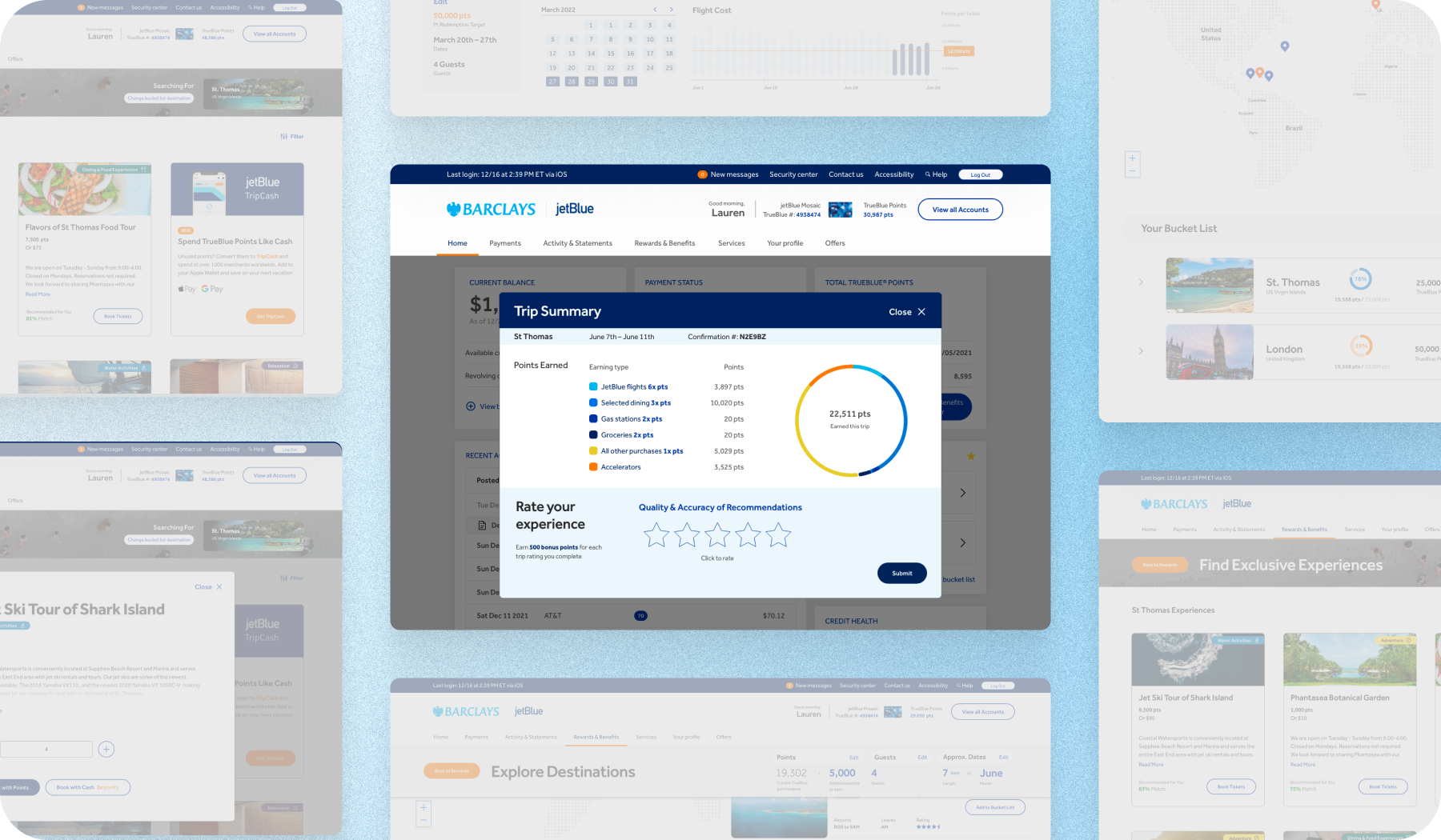
Lauren's destination experience, on-trip point utilization, and post-trip summary patterns. Delivered by the broader IBM team; I contributed to research synthesis and review.

Most of the design decisions came down to which surface owned which moment, and what that moment owed the person in it. Answering that question per surface is what kept two design systems feeling like one product.
Strategy starts with which product, which goal, which cardmember.
We weren't able to access post-launch data for this engagement. If we had, the two numbers I'd look at first are card application rate from inside the booking flow (compared against the baseline checkout upsell) and widget interaction rate by cardmember segment on the Barclays side. The one guardrail on both: JetBlue's core booking completion rate couldn't drop.