Chase's 25-year-old Bill Pay shared its home with Zelle, and new customers couldn't tell the two apart.
Bill Pay shared a landing page with Zelle, so new customers couldn't tell the two products apart. They couldn't find Bill Pay's features, and these new users had the lowest payment submission rate of any Bill Pay user.
These numbers made Bill Pay's new user experience the highest priority surface in Banking Payments. I led the redesign, starting with the landing page architecture, then expanding into onboarding as a parallel workstream.
I defined the insight areas, built prototypes for both rounds, and contributed to synthesis. Round 1 was a generative concept study with first-time users. Round 2 was a usability test with 12 participants across new, infrequent, and frequent segments, covering completing a payment, adding a payee, and finding a past transaction. That round hit a 92% task completion rate.
The sharpest finding came from Round 1: every new user described Bill Pay using language borrowed from another product. They weren't failing to use the page. They couldn't identify which part of it was Bill Pay at all. The shared surface made the products look like features of one another.
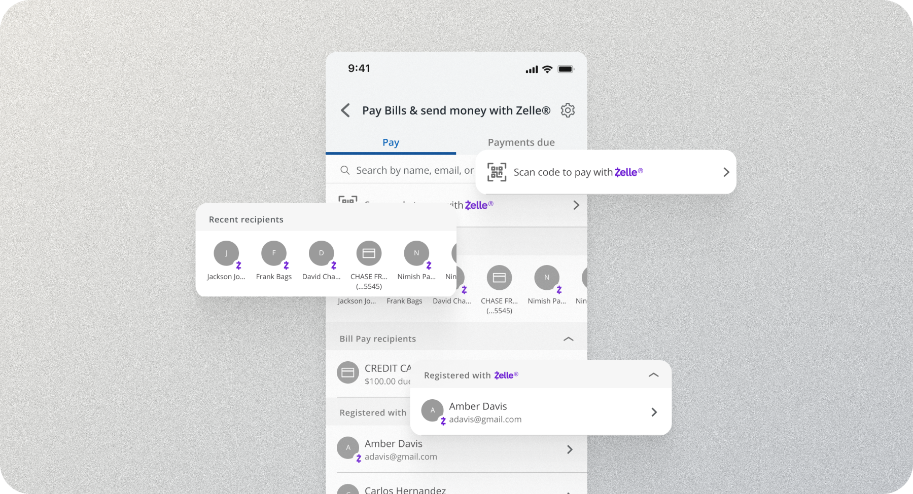
"This is a lot to process. There's the Zelle stuff, but then there's Bill Pay recipients at the top, at the bottom. It just feels like there's a lot on the screen."First-time customer, Concept testing, Round 1
Research pointed to two problems: users landed on the page without knowing what Bill Pay was, and the page tried to do too much. The first was why onboarding became its own project alongside the redesign. The landing page alone couldn't fix confusion that started before users ever reached it. The second was about narrowing what the landing page itself should do.
Users dropped off because they couldn't tell Bill Pay apart from Zelle before they'd done anything at all.
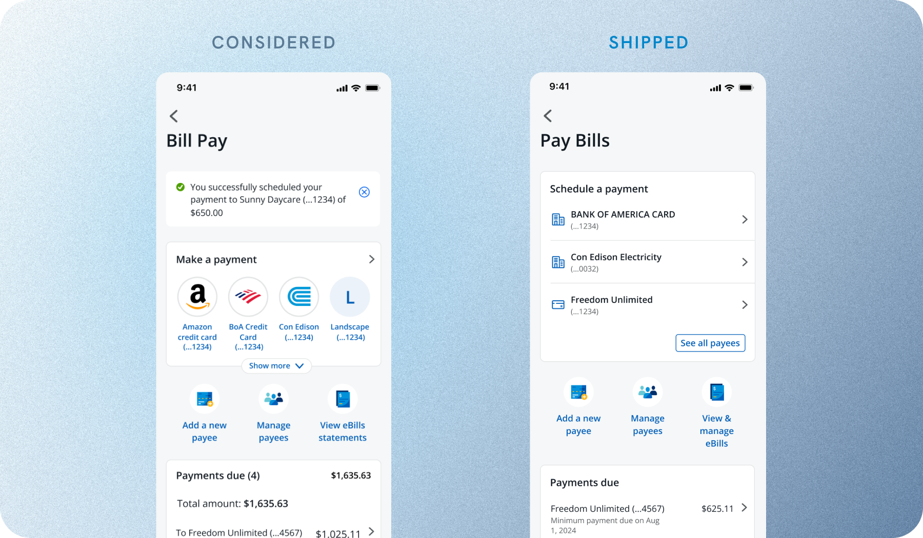
The Concept version borrowed patterns from the Direct Deposit Account and Plan & Track teams. It tested better and looked better. Before the formal feasibility review, I pulled in the engineering lead for a quick check on custom-code surface area and API dependencies. It confirmed what the designs were already hinting at: too much custom build-out, unresolved dependencies, and no clear path inside our timeline.
We made the call together to descope it, saving weeks of back-and-forth in sprint planning and giving the team runway to land the MVP cleanly.

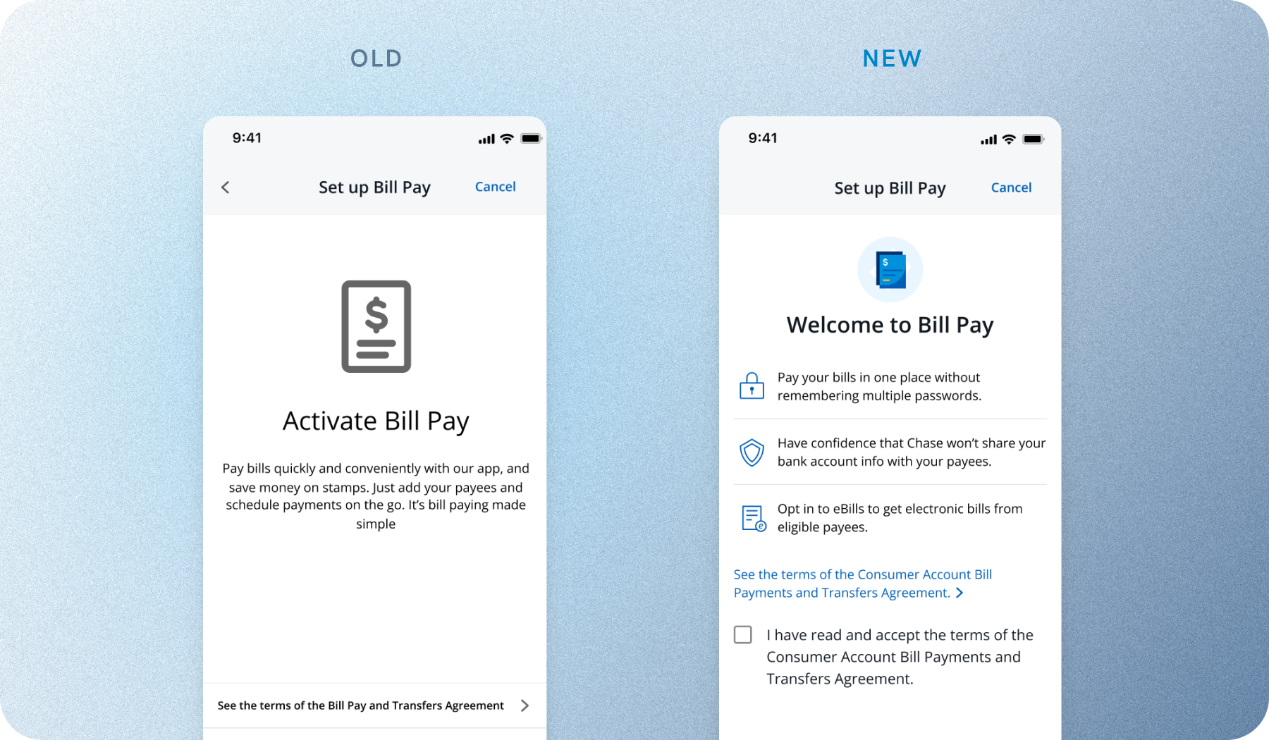
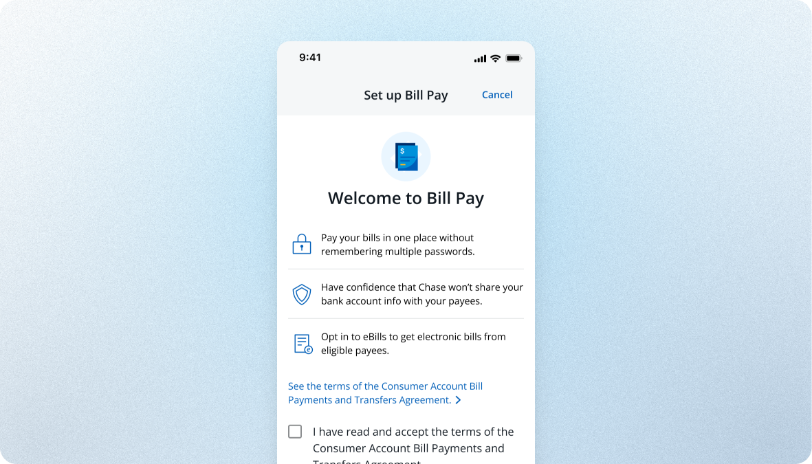
The existing onboarding opened with one header and one sentence covering all of Bill Pay's value, broad enough to mean nothing to a first-time user. We explored a full walkthrough: three separate screens, one value prop each. It would have given each message room to land, but every additional screen was another exit point for the segment with the lowest submission rate.
I pushed to keep it on one screen but structure the content as three distinct value props. It gave users specificity without the friction cost: memorable enough to form a mental model, compressed enough to not lose them.

Round 2 surfaced a confusion: every participant misunderstood how Payments Due populated. They assumed it showed every bill they owed, when it only listed payees they'd already added. The risk was real: a user could trust an incomplete list, assume nothing was due, and miss a bill that never appeared there. The default fix would have been a help article. I argued for an inline info icon that explained what the list did and didn't include. It was slight engineering work added to MVP scope, but it closed the gap that would have driven missed-payment complaints. The PM agreed quickly. It's the smallest thing that shipped, and probably the highest-leverage.
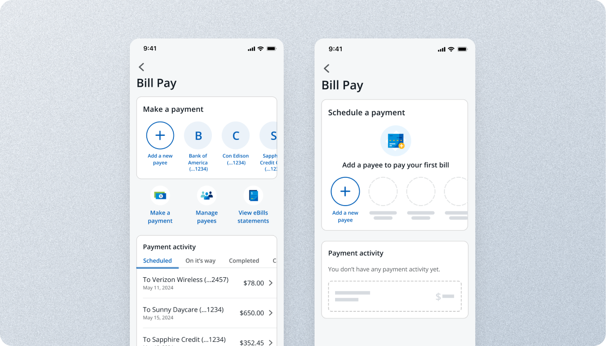
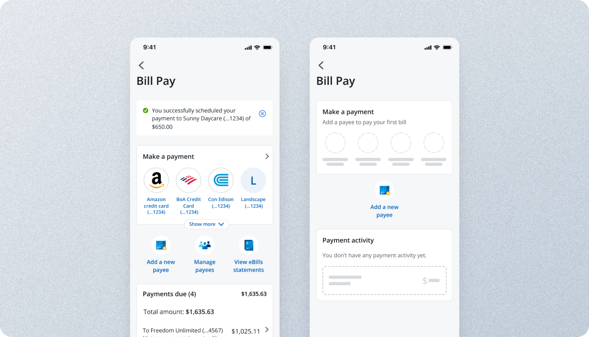
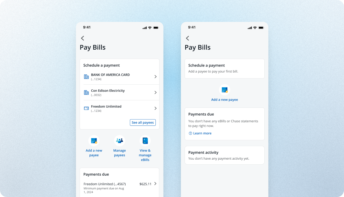
Each version narrowed the design toward what was feasible inside a component system, trading ambition for what could realistically ship.
The three principles were applied, but in a barebones way. Every feature was visible, product surfaces visually merged, and horizontal scrolling of payees and activity filters surfaced ADA compliance issues.

Borrowed patterns from Direct Deposit Accounts (DDA) and Plan & Track. Bill Pay had its own visual identity, but it was technically infeasible for our timeline: too much custom code and unresolved API issues.

Built entirely on off-the-shelf components from MDS, Chase's native design system, with Bill Pay's surface finally separated from Zelle's. More edge cases surfaced along the way, and the MVP is currently scheduled for a customer pilot.

Bill Pay had a dedicated onboarding flow, but its welcome screen opened with one generic sentence that could have described any payments product. I restructured the content around three distinct value props: specific enough to stick, and compressed onto one screen so the flow didn't add friction to a segment already struggling to complete.
I swapped the original one-line pitch for three value props, each naming something Bill Pay actually does instead of marketing speak. The legal agreement sits up front, and there's just one primary action to take.

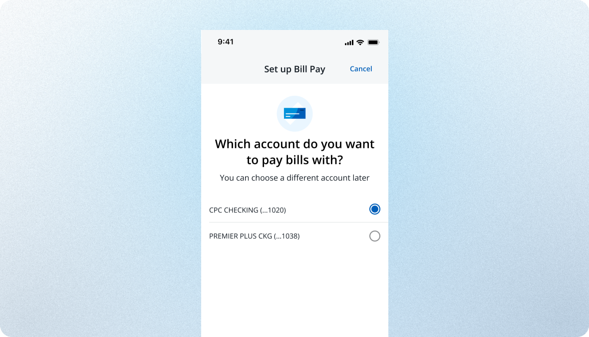
Just one question here. I added a reassurance line, "You can choose a different account later," to answer the "am I locked in?" hesitation that kept coming up in testing.

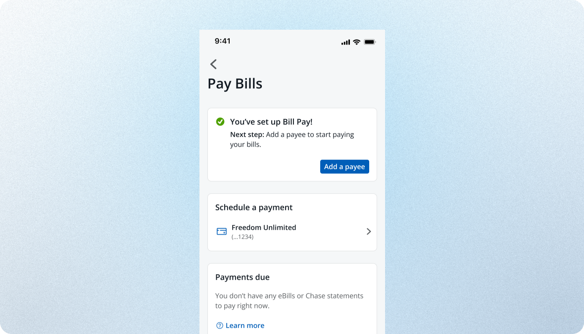
The confirmation screen doubles as a launchpad. Instead of a generic success state, it says "You've set up Bill Pay. Next: add a payee," with the CTA right there, so users carry straight into their first payment.

Baseline. The evaluative usability round hit 92% task completion. The post-launch framework below builds on that baseline to track whether the redesign holds in production.
The hardest part wasn't the design. It was deciding what not to ship. The Concept Design was more ambitious, but the MVP is the version that reaches a customer opening the Chase app for the first time. It leaned on proven patterns and stayed compliant with ADA guidance, not because it was flashier, but because it was the safer, more accountable bet for that customer. I'd make that tradeoff again.
Two things I'd change. First, I'd start the onboarding workstream before getting deep into the landing page. Every research round pointed there, and I waited too long to make the case. Second, I'd loop in legal from the start, since the onboarding content went through multiple revisions because value-prop claims had to be carefully vetted. Knowing those constraints earlier would have meant sharper content from the first prototype.
The highest leverage decisions on this project were content, IA, and scope.